Calculating and Graphing Grouped Data
Expert reviewed • 22 November 2024 • 18 minute read
- classify data relating to a single random variable
- organise, interpret and display data into appropriate tabular and/or graphical representations
including Pareto charts, cumulative frequency distribution tables or graphs, parallel box-plots and two-way tables
- compare the suitability of different methods of data presentation in real-world contexts
- summarise and interpret grouped and ungrouped data through appropriate graphs and summary statistics
Note:
Video coming soon!
What is a Sample?
A sample is a subset of a larger group that is used to represent and analyse the characteristics of that population. When displaying data, samples are used to make assumptions about the general population, without having to collect data from every individual. The sample should ideally be representative of the population to ensure accurate generalisations.
What is the Importance of Grouping Data?
Grouping data involves organising raw numeric data, discrete or continuous, into classes or intervals to make it easier to analyse and interpret. This is particularly useful when dealing with large datasets. It is an essential step that enhances the clarity, efficiency and effectiveness of mathematical calculations and statistical analysis.
What are Class Intervals and Their Components?
Class intervals divide a dataset into non-overlapping groups or ranges. Each interval contains a subset of the data values, allowing us to count how many data points fall within each range. As such, it can be highly useful when we are required to create frequency distributions and histograms.
The following points, are components of class intervals:
- Lower Class Limit: The smallest value that can belong to a class interval.
- Upper Class Limit: The largest value that can belong to a class interval.
- Class Width: The difference between the upper limit of one class and the lower limit of the next class. The class width could also be the difference between the upper and lower boundaries within the same class.
- Class Midpoint: The average of the upper and lower limits of a class.
- Class Boundaries: The points that separate the classes without gaps. For continuous data, class boundaries can be slightly adjusted to prevent gaps between intervals.
The following example presents a dataset and a corresponding frequency table that refers to its class intervals and their components. The point of creating a table like this is to help us see the bigger picture and give us a better understanding of the information, to assist us in answering a given question.
The dataset below explores the ages of 30 people that are employed to work for a shoe store.
| Interval | Class Centre | Frequency | Cumulative Frequency |
|---|---|---|---|
| 10-14 | 12 | 1 | 1 |
| 15-19 | 17 | 5 | 6 |
| 20-24 | 22 | 6 | 12 |
| 25-29 | 27 | 7 | 19 |
| 30-34 | 32 | 4 | 23 |
| 35-39 | 37 | 5 | 28 |
| 40-44 | 42 | 2 | 30 |
| 45-49 | 47 | 1 | 31 |
| 50-54 | 52 | 1 | 32 |
Histograms and Polygons
A frequency histogram is a type of bar graph that represents the frequency distribution of a dataset. It displays the frequency of each class interval or range of values occurring in each dataset. An example of a frequency histogram is displayed below:

where,
- (the y-axis) is the frequency of each class interval
- (the x-axis) is the class interval
In the graph each bar represents a seperate class interval. They must be shown to be touching to indicate that the data is continuous.
A frequency polygon is a line graph that represents the frequencies of the data. It is often used in conjunction with histograms, where the graph includes bars and lines. The bars represent the class intervals. The line (a feature of the polygon) travels to the midpoint of each bar. This means that the line travels to the class centre of each group. An example of a frequency polygon is displayed below:

A cumulative histogram is a histogram that shows the cumulative frequency distribution of a dataset. Instead of displaying the frequency of each class interval, it displays the cumulative frequency up to and including each class interval. Thus, the only graphical difference from a frequency histogram is seen on the y-axis. In this case, it measures the cumulative frequency rather than the frequency of each class. These graphs still use bars to represent each class.
A cumulative frequency polygon is an expansion on the graphical representation of a cumulative frequency distribution. It is similar to a frequency polygon but uses cumulative frequencies instead of individual class frequencies. This graph still uses bars and lines to represent the class intervals. The following graph shows the aspects of a cumulative frequency polygon and cumulative histogram.
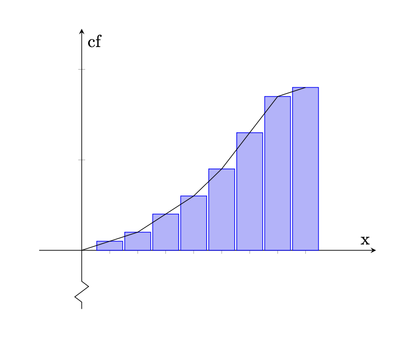
where,
- (the y-axis) is the cumulative frequency of all class intervals
- (the x-axis) is the class interval
As seen in the graph, the bars continuously get larger in value, indicating that cumulative frequency of each class being added together.
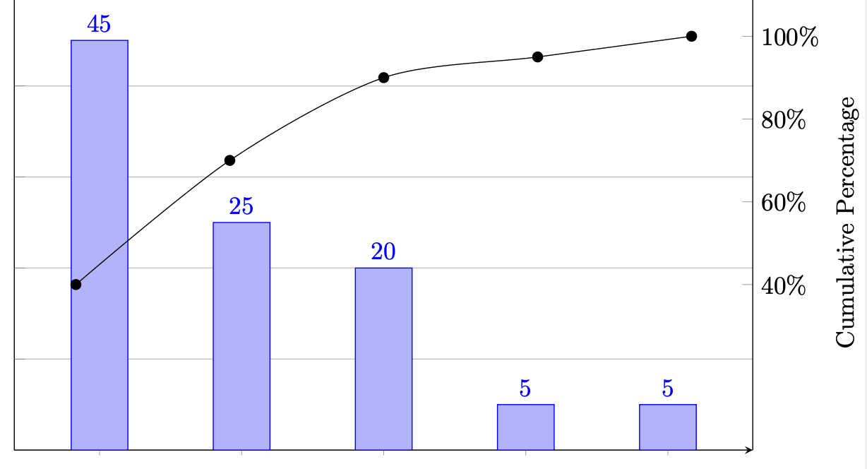
What is a Pareto Chart?
A Pareto chart is a type of graph that combines both a bar graph and a line graph. This is seen as a frequency histogram arranged in descending order, combined with a cumulative frequency polygon. An example of a Pareto chart is displayed below.
How to Calculate the Mean of a Sample
The mean of a sample provides an average value of the data points in the sample, indicating where the centre of the data distribution lies. This is different to calculating the mean of a distribution, which will be explored in the following module.
To calculate the mean of a sample, we first need the values of the sample. For example, the frequency table below provides information to calculate the mean of a sample.
| Interval | Class Centre (x) | Frequency (f) | Sum (Σfx) |
|---|---|---|---|
| 10-14 | 12 | 1 | 12 |
| 15-19 | 17 | 5 | 85 |
| 20-24 | 22 | 6 | 132 |
| 25-29 | 27 | 7 | 189 |
| 30-34 | 32 | 4 | 128 |
| 35-39 | 37 | 5 | 185 |
| 40-44 | 42 | 2 | 84 |
| 45-49 | 47 | 1 | 47 |
| 50-54 | 52 | 1 | 52 |
| Total | 32 | 914 |
The formula used to calculate the mean of this sample is thus show below:
Where,
- is the sample mean,
- represents each individual data point,
- is the total number of observations in the sample (this is the total frequencies of the sample),
- is the sum of all the data points.
Practice Question 1
For the information provided in the table above, calculate the mean of the provided sample.
Solution
Looking at the formula above, we can see that it is easy to calculate the mean. We must first however, determine all the variables in the formula using the table above.
Finding the sum of products of class centres and frequencies:
As we can see from the table, the total number of frequencies is:
Now, we can calculate the mean using the given formula
The mean of the sample is approximately
How to Calculate the Variance and Standard Deviation of a Sample
The variance of a sample, represents the average of the squared differences between each data point and the sample mean. Variance is essential for understanding how much the data points differ from the mean and from each other.
The sample variance is denoted by and is calculated using the following formula:
The standard deviation of a sample quantifies how spread out the data points are around the mean. A low standard deviation indicates that the data points are close to the mean, while a high standard deviation indicates that the data points are spread over a larger range. It is found by taking the square root of the variance.
Practice Question 2
Using the frequency table provided, calculate the variance of the sample. Use the mean found in the previous example to assist your calculations.
| Interval | Class Centre (x) | Frequency (f) | Sum (Σfx) | Sum (Σfx²) |
|---|---|---|---|---|
| 10-14 | 12 | 1 | 12 | 144 |
| 15-19 | 17 | 5 | 85 | 1445 |
| 20-24 | 22 | 6 | 132 | 2904 |
| 25-29 | 27 | 7 | 189 | 5103 |
| 30-34 | 32 | 4 | 128 | 4096 |
| 35-39 | 37 | 5 | 185 | 6845 |
| 40-44 | 42 | 2 | 84 | 3528 |
| 45-49 | 47 | 1 | 47 | 2209 |
| 50-54 | 52 | 1 | 52 | 2704 |
| Total | 32 | 914 | 29058 |
Solution
Seen from the previous example question, we know that the mean of this sample is approximately . Additionally from the table, we know that the sum of the class centre squared, multiplied by the frequency is . The total number of frequencies is .