Understanding Bivariate Data
Expert reviewed • 04 March 2025 • 16 minute read
- construct a bivariate scatterplot to identify patterns in the data that suggest the presence of an association
- use bivariate scatterplots (constructing them where needed), to describe the patterns, features and associations of bivariate datasets, justifying any conclusions
- describe bivariate datasets in terms of form (linear/non-linear) and in the case of linear, also the direction (positive/negative) and strength of association (strong/moderate/weak)
- identify the dependent and independent variables within bivariate datasets where appropriate
- describe and interpret a variety of bivariate datasets involving two numerical variables using real-world examples in the media or those freely available from government or business datasets
- solve problems that involve identifying, analysing and describing associations between two numeric variables
- construct, interpret and analyse scatterplots for bivariate numerical data in practical contexts
- calculate measures of central tendency and spread and investigate their suitability in real-world contexts and use to compare large datasets
- describe, compare and interpret the distributions of graphical displays and/or numerical datasets and report findings in a systematic and concise manner
Note:
Video coming soon!
What is Bivariate Data?
Bivariate data refers to data that involves two different variables. The main objective of analysing bivariate data is to understand the relationship between the two variables. This data is commonly represented in paired observations, where each pair consists of values of the two variables under consideration. For example, the height and weight of individuals are two variables that can be compared against each other.
What is Correlation?
Correlation measures the strength and direction of the linear relationship between two variables. It is quantified using the correlation coefficient, often denoted as . This variable is referred to as Pearson's Correlation Coefficient.
We calculate a set of data's Pearson Correlation Coefficient when given points on a graph that compare two variables. The coefficient will provide an indication of the strength and direction of the relationship between the two variables.
Positive, Negative and Zero Correlation
- Positive Correlation: Both variables increase together. The scatter plot shows an upward trend. The closer the value is to , the more positive the correlation is.
-
Negative Correlation: One variable increases while the other decreases. The scatter plot shows a downward trend. The closer the value is to , the more negative the correlation is.
-
No Correlation: There is no linear relationship between the variables. The scatter plot does not show any readable trend.
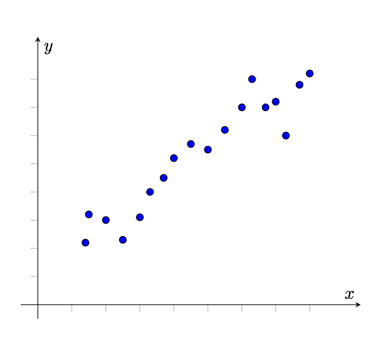
For example, the following scatterplot graph, depicts a dataset with a positive correlation, seen as the data points travel upward in a linear trend.
How to Measure Correlation?
By using a calculator, we can easily determine a value for Pearson's Correlation Coefficient of a dataset. Listed below is a step-by-step process that you can follow to determine a value for . It is important to note that this process will alter slightly depending on the model of the calculator you are using. However, most calculators share a similar process.
- Prepare all your data: This means you must have all your values for two different variables and , ready to input into your calculator.
- Input data: To do this, you must change your calculator into statistics mode. On many calculators, this is done by pressing the 'mode' button and changing it to statistics mode.
- Once in statistics mode, you will be given a choice of different tables to input your variables into. Select the option that presents a table in the form: . This will provide you with a template to input your value into.
- Input your known variables into the table within your calculator. Ensure you have entered the correct values before moving on to the next step. Once you have entered all your values, you may press the 'ON' button.
- Find the 'STAT' button on your calculator and press it. This button will vary depending on the calculator. Some calculators may require you to first press 'SHIFT' or 'ALPHA' to access the 'STAT' button.
- After completing the previous step, you will be taken to a screen asking which results you would like to receive from the data you have previously provided. Select the option which provides you with the values for regression.
- The Pearson Correlation Coefficient of your data should then appear on the screen.
Practice Question 1
The following data involves two variables and , which represent the categories of age and spending respectively. Determine Pearson's Correlation Coefficient for this data presented in the table below:
| X (Age) | Y (Spending) |
|---|---|
| 22 | 150 |
| 25 | 180 |
| 27 | 200 |
| 30 | 220 |
| 33 | 250 |
| 35 | 270 |
| 37 | 280 |
| 40 | 310 |
| 42 | 330 |
| 45 | 350 |
Solution
Using the steps provided above, we can use a calculator to determine .
First we must input all data provided above into a table in the form , while the calculator in statistics mode. After we have done this we must determine the value of , by going into 'STAT' mode and pressing on the regression results.
After doing this we can see that . This means that the data is almost perfectly linear in a positive direction.
Regression and the Line of Best fit
Regression involves finding the relationship between two variables and using this relationship to make predictions. The line of best fit (or regression line) is the straight line that best represents the data on a scatter plot.
The equation of the line of best fit is typically written as:
where:
- is the dependent variable,
- is the independent variable,
- is the slope of the line,
- is the y-intercept.
The method to finding the line of regression of a dataset is similar to finding Pearsons corelation coefficient. A calculator can determine a result for the line of regression, however all it will do is provide you with values that make up the formula . On most calculators, the variable is represented by and the variable is presented as the term . Thus, we can see the equation for the line of best fit, or regression line, as . The steps listed earlier can be followed to find the regression line.
The method for finding the line of regression of a dataset is similar to finding Pearson's correlation coefficient. A calculator can determine a result for the line of regression, however, all it will do is provide you with variables that make up the formula . On most calculators, the variable is represented by and the variable is presented as the term . Thus, we can see the equation for the line of best fit, or regression line, as . The steps listed earlier can be followed to find the regression line.
Practice Question 2
Determine the line of regression of the dataset provided in the previous question. For a reminder the table has been placed below.
| X (Age) | Y (Spending) |
|---|---|
| 22 | 150 |
| 25 | 180 |
| 27 | 200 |
| 30 | 220 |
| 33 | 250 |
| 35 | 270 |
| 37 | 280 |
| 40 | 310 |
| 42 | 330 |
| 45 | 350 |
Solution
First we must input all data provided above into a table which allows for two variables to be calculated, while the calculator in statistics mode. After we have done this we must determine the value of and , by going into 'STAT' mode and pressing on the regression results.
After doing this we can see that and . Thus, by substituting in values, we can see that the formula for the line of best fit this data creates is: .