Supply vs Demand Graphs
Expert reviewed • 04 March 2025 • 6 minute read
What is The Purpose of a Supply vs Demand Graph?
An aggregate supply and demand graph shows the relationship between the total quantity of goods and services supplied and demanded at different price levels in an economy. This graph further displays, how market forces determine the equilibrium price and quantity of a commodity. A basic supply vs demand graph is displayed below.
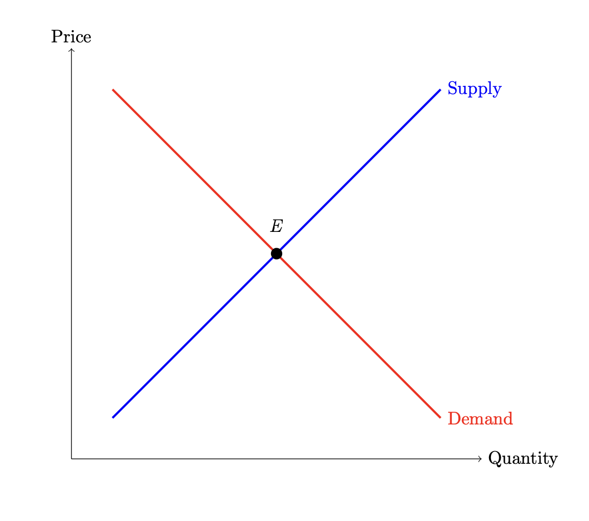
As seen in the grpah above, its elements are as follows:
- Axes: The horizontal axis represents Quantity, and the vertical axis represents Price.
- Supply Curve: This upward-sloping curve shows that as price increases, the quantity supplied also increases.
- Demand Curve: This downward-sloping curve illustrates that as price increases, the quantity demanded decreases.
- Equilibrium Point: This is where the supply and demand curves intersect, representing the market equilibrium.
Shifts in Supply and Demand
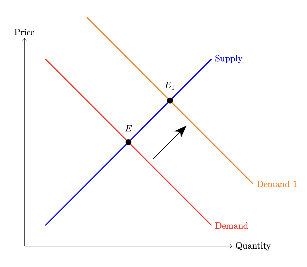
Now, alone a supply and demand graph does not demonstrate or provide much information. Thus, they are not useful to use in your economics responses unless you display a shift in one of the curves.
Shifts in the demand curve are often caused by changes in consumer confidence, government policies, changes in the levels of investment, and changes in net exports.
- Rightward shift: Indicates an increase in aggregate demand and an increase in price.
- Leftward shift: Indicates a decrease in aggregate demand and a decrease in price.
The graph below demonstrates an increase in demand, and thus an increase in price.
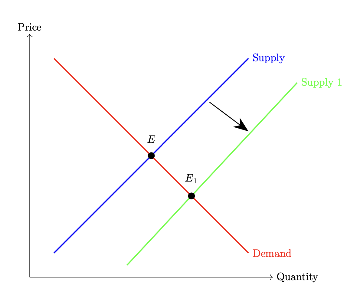
Furthermore, shifts in the supply curve are caused by changes in input prices, technology, and supply shocks.
- Rightward shift: Indicates an increase in aggregate supply and a decrease in price level.
- Leftward shift: Indicates a decrease in aggregate supply and an increase in the price level.
The graph below demonstrates a shift rihgt in the supply curve, and thus a consequent decrease in price.
How to Implement This Graph Into Your Responses
The supply vs demand graph is one of the most commonly used graph examples in HSC exams. This is because it can be used in almost all chapters and all questions. TO use this graph effectivley you can reference it anytime you talk about a shift in supply or demand. This doesn't just have to be in commodities, but it could also be in relation to concepts such as exchange rates. Be careful however, when you reference a graph like this t correctly label the supply and demand curves. Always rememebr, supply sopes upwards, and demand slopes downward.